

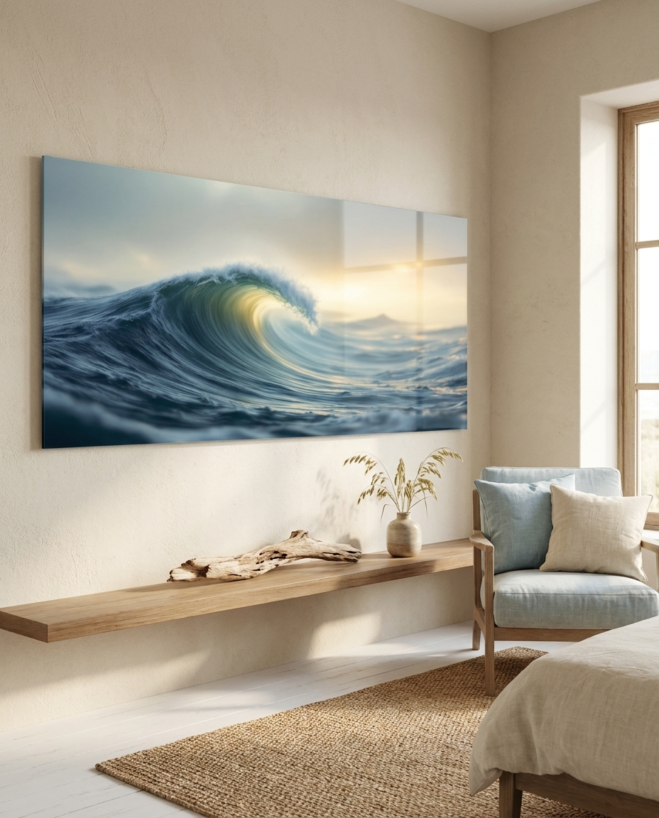
Tides returns again and again to the same subject: the sea, seen slowly. Eight works follow the water through its moods, from the still surface at slack tide to the long swell and the foam at the shoreline, always with a horizon to hold the eye.
The need — a calm that breathes
Our decorator sees the sea as one of the most reliable choices for a home that needs rest. Water brings movement without noise, and a clear horizon gives a room air. Slack Water and Silver Ripples are made for a bedroom or a reading corner; The Long Shore and Pale Estuary open a living room with a wide, quiet line. Against the soft sage walls of the new season, their muted slate and silver tones settle the space rather than competing with it.
The production — the tide as a way of seeing
The art director treated the series as a study in gradations: how light changes on water between one moment and the next. Tone is everything here. Foam and Slate and Deep Swell carry weight and texture, while Breaking Light is the brightest point in the set, the moment the sun finds the crest. Storm Front brings the same sea under a heavier sky, so the collection moves from calm to motion without leaving its horizon.
The sale — the calm people keep
Our gallerist knows that seascapes sell for their staying power: people choose them for a home they will live with for years. One work over a console or a bed is the simplest choice; a pair such as Slack Water and Breaking Light tells the story of a single tide from stillness to motion. On acrylic glass, the water gains a soft depth and the light on the surface becomes the one gleaming element in an otherwise matte, restful room.