

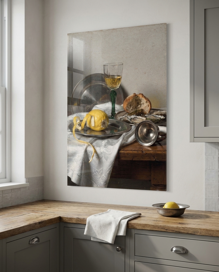
In the middle of the seventeenth century, a small, flat, rain-washed country on the edge of the North Sea produced more paintings than almost anywhere on earth — and it painted, above all, itself. Not saints in glory, not emperors on horseback, but a swept hall, a half-peeled lemon, a ship leaning into grey weather, a woman mending linen by a window. The Dutch Golden Age is the moment European painting discovered that ordinary life, looked at patiently enough, could hold as much wonder as any altarpiece.
Where the Dutch Golden Age sits in the story of art
The Dutch Golden Age runs roughly from 1620 to 1680, in the young Dutch Republic that had just broken away from Spanish rule. It is exactly contemporary with the Italian painters we followed in the Baroque, and it shares their hunger for truth to nature — but it points that hunger in a completely different direction. Where Rome built its art for churches and palaces, Amsterdam, Haarlem, Delft and Leiden built theirs for private houses.
That difference came from the society itself. The Republic was a trading nation run by merchants rather than a court, and its reformed churches had whitewashed their walls and taken the images down. The great patrons of the south were largely absent. In their place appeared something new: an open market for paintings, where thousands of middle-class households bought pictures the way we buy books, and where painters specialised the way craftsmen do — one in flower pieces, another in church interiors, another in seascapes, another in quiet rooms. It was, in effect, the first modern art market.
Its roots run back to the Northern Renaissance and its obsessive, jewel-like detail. Its descendants are everywhere: in eighteenth-century genre painting, in nineteenth-century realism, and in almost every photograph ever taken of light falling across a kitchen table.
What actually defines it
Daylight from one side. The signature of the period is a soft, cool, silvery light entering through a tall leaded window on the left, sliding across a plaster wall, a tiled floor, a sleeve. It is calm and continuous, with gentle shadows — the opposite of the hard spotlight of Roman tenebrism.
The domestic interior. Black-and-white marble floors running away in perspective, whitewashed walls, heavy oak tables, brass and pewter, blue-and-white tiles along the skirting, and, again and again, a view through an open door into a further room or a sunlit courtyard. Space itself becomes a subject.
Still life as a portrait of things. Pewter, glass, bread, oysters, a lemon whose rind spirals over the edge of the table — painted with a tactile exactness that makes you want to reach in. Behind the pleasure there is often a quiet reminder that all of it passes.
The high sky. In a country with no mountains, the drama moved upward. Landscapes sit on a very low horizon and give most of the picture to towering cumulus, with moving patches of sunlight crossing the polders below. Seascapes do the same over grey-green water.
Calm and modesty. People are absorbed in their tasks — sewing, sweeping, reading, talking quietly under a church column — and nobody is performing for the viewer. The feeling is of a world that would carry on exactly the same if you walked away.
The palette. Silver-grey, pale plaster ochre, ultramarine and warm lead-tin yellow, oak brown, pewter, the soft green of wet fields, and the white of linen. Luminous rather than dark.
The need
After a collection built on darkness and drama, our three experts wanted the opposite register: light, calm and order. The Dutch Golden Age is also the movement whose original purpose is closest to our own. These pictures were made to be lived with in real homes, bought by real households, and hung in rooms where people ate, worked and slept. Very few moments in the history of art translate so directly to a contemporary interior.
The brief kept every figure an invented adult in plain wool and linen, and it kept every composition original: no famous room, no identifiable town, no quotation of a known canvas. The eight subjects map the movement’s specialisms — the genre interior, the view through a door, the breakfast piece, the flower piece, the polder landscape, the marine, the church interior and the small-town street.
The production
The art direction fixed one language for the whole set: oil on fine panel or canvas, smooth blended shadows, tiny precise highlights on metal and glass, thin glazes, fine craquelure and a mellow old varnish. Every master then went through the studio’s quality control. Paintings in this manner tend to arrive with invented signatures, dates and inscriptions tucked into corners, on floor slabs and even engraved into pewter, and each of them was found and cleaned by hand before any work was placed in its room for the shop.
The production, seen work by work
The Mending by the Window is the genre interior in its purest form: a woman in a blue wool jacket and white cap, mending linen at a small oak table, with the cool light of a leaded window falling across the plaster and a row of blue-and-white tiles at the foot of the wall.
The Open Door is about space as much as people. From a shadowed hall with a chequered marble floor, the eye travels through a doorway into daylight and on to a walled courtyard with a single young tree, past a broom and a pair of wooden clogs left on the tiles.
Breakfast with a Lemon is the classic breakfast piece: pewter plates, a green-stemmed wine glass, a broken roll, oysters, a silver cup on its side, and a lemon whose peel hangs in a long spiral over a crumpled white cloth. Silver-grey and yellow, nothing more, and nothing missing.
Tulips in a Blue Vase sets flamed and striped tulips, a white rose and a blue iris in a blue-and-white vase inside a stone niche, with a butterfly, a snail and a dewdrop for anyone who looks closely — a reminder of the country’s famous passion for rare bulbs.
The Low Horizon gives four fifths of the picture to the sky. Beneath the towering clouds, a thin green strip of polder holds a winding river, a few grazing cows, a church spire and a windmill, with sunlight moving across the fields.
Grey Weather at Sea puts a three-masted merchant ship under full sail on a choppy grey-green sea, with two small fishing boats working nearby and a band of silver light on the horizon: the trade on which the whole Golden Age was built.
The Whitewashed Church is the reformed interior: bare white walls, pale columns, clear windows pouring light, a dark carved pulpit, brass chandeliers on long chains, a few quiet figures in conversation and a dog crossing the worn stone floor.
The Quiet Street closes the set outdoors, in front of a stepped-gable brick house with red shutters, where one woman sews on the doorstep and another sweeps the cobbles under a soft overcast sky.
The sale
Each work is offered as a print face-mounted behind acrylic glass, in nine sizes, ready to hang. The finish is a natural partner for this movement: the glossy acrylic face deepens the colour and gives the pale, luminous passages — a lit wall, a sky, a white cloth — a clarity that recalls the fine, glassy surfaces Dutch painters achieved with their thin glazes.
These are the most home-friendly pictures in the series so far. The breakfast piece and the tulips belong in a kitchen or a dining room. The mending woman suits a bedroom or a reading corner. The open door and the quiet street work beautifully in a hallway or a breakfast nook, where they seem to extend the house. The landscape, the marine and the church interior are the calm, spacious ones, ideal above a sofa, in a study or in a library, against a light wall that lets their daylight breathe.
See the collection
The eight works are here: Dutch Golden Age.
Next in the chronological walk through art history: the Flemish Baroque, just across the border, where the same century chose abundance, movement and colour over Dutch calm.