

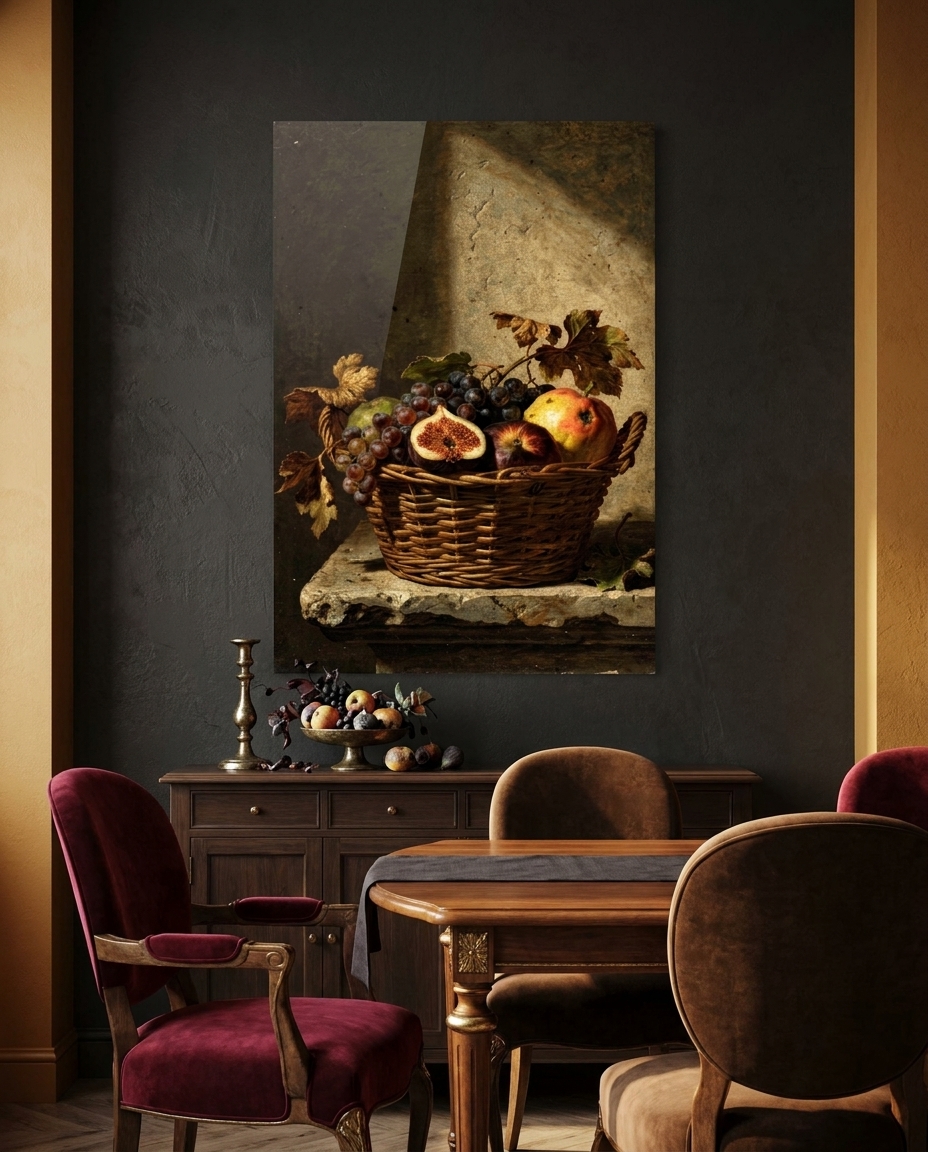
Around 1600, in Rome, painting did something it had never quite dared before: it turned most of the lights off. After a generation of cool, crowded, knowingly clever pictures, a handful of painters decided that the way to reach a viewer was not elegance but conviction — one hard light out of a great darkness, real hands, real cloth, real dirt under the fingernails, and a composition that drives at you on a diagonal instead of turning politely in place. That decision is the Baroque, and it is the reason a church full of strangers could stand at the far end of a nave and feel that something was happening to them personally.
Where the Baroque sits in the story of art
The Baroque runs, in its Italian heartland, from roughly 1600 to about 1680, with Rome as its capital and the rebuilt churches, palaces and piazzas of the city as its laboratory. It follows directly on Mannerism, and in many ways it is a reply to it: where the maniera had grown airless, artificial and cool, the new art wanted weight, heat and directness. Behind it stand the great solutions of the High Renaissance and the rich, loaded colour of the Venetian Renaissance; ahead of it lie the national schools it seeded across Europe — Dutch, Flemish, Spanish — and, much later, the lighter, sweeter Rococo.
The word itself was an insult. “Baroque” probably comes from a Portuguese term for an irregular pearl, and eighteenth-century critics used it to mean bizarre, overwrought, in bad taste. The name stuck long after the contempt wore off. Today it names one of the most persuasive moments in the history of Western art: the moment when painters such as Caravaggio and Annibale Carracci, sculptor-architects such as Bernini and Borromini, and later painters such as Artemisia Gentileschi made pictures and buildings designed to act on the body as much as on the mind.
It was also, openly, an art with a job to do. After the religious upheavals of the sixteenth century, the Church wanted images that were clear, moving and immediate — images that an ordinary congregation could feel without a lecture. The Baroque delivered exactly that, and princes and collectors quickly borrowed its language for palaces, ceilings and private cabinets.
What actually defines it
Tenebrism. The picture is mostly darkness. A single hard source — a candle, a lamp, one shaft from a high window — carves a few lit passages out of a warm black, and the edge between light and shadow is abrupt rather than gradual. Nothing is evenly lit, and that is the point: the eye goes exactly where the painter sends it.
The diagonal. Renaissance pictures tend to be built on balance. Baroque pictures are built on thrust. A falling swag of cloth, a stair, a beam of light, a turning body — energy runs corner to corner, and the scene is caught mid-movement rather than at rest.
Naturalism without flattery. Creased skin, blunt knuckles, coarse wool, chipped earthenware, a leaf browning at the edge. The Baroque puts ordinary matter under a theatrical light and refuses to prettify it, which is precisely what made it so convincing — and, in its own day, so controversial.
Architecture that moves. Facades swell and curve back, columns twist like rope wrapped in carved vine, pediments break and double. Stone, coloured marble and gilt bronze are handled as if they were cloth. The building is no longer a calm container; it is part of the drama.
The opened ceiling. Painters learned to continue the real architecture of a vault upward in paint, foreshortened hard, until it dissolves into cloud and light seen from directly below. The Italians called it di sotto in sù — “from below, upward” — and it remains one of the great illusions in European art.
The palette. Warm black and bitumen brown, umber and ochre, old gold, deep crimson and lake red, olive, and a few cold whites of linen. Low-keyed and rich, saturated only where the light lands.
The need
The Baroque is famous for its lit nudes and its martyrdoms, and our three experts made a clear decision before a single image existed: this collection would not go there. Not because that part of the period is unimportant, but because the movement’s real invention — the thing that makes it Baroque and not something else — is the light, and light can carry the whole drama on its own. So the brief was to tell the Baroque through what it lit: the candlelit elder, a consort of musicians, a scholar’s still life, a basket of fruit, a moving church interior, an opened vault, a goldsmith’s reliquary and a cloak thrown out by the wind. Every figure is an invented adult, robed from throat to floor.
The other need was commercial, and it is simple. Baroque pictures are among the most readable images ever made at a distance. A single lit passage in a dark field carries across a room at three metres, and a dark wall picture gives a space an immediate sense of gravity and warmth. That is exactly what a library, a study or a candlelit dining room asks of a work of art.
The production
All eight are original compositions — homages to the period’s manner, never reproductions of a particular painting, church or object. The art direction fixed the language once for the whole set: oil on a coarse, warm-grounded canvas; the dark ground showing through the thin shadows; confident loaded strokes in the lights; fine craquelure and an old yellowed varnish. A painter’s surface, not a photograph and not a clean render.
Each work then went through the studio’s quality control. Painted styles like this one have a habit of arriving with an invented “artist’s signature” in a corner, and every master was examined corner by corner and cleaned by hand where needed. Two compositions were redrawn outright because they had drifted from the brief. Only when all eight were right were they placed in their rooms for the shop.
The production, seen work by work
The One Candle is the purest statement of tenebrism in the set: an elderly figure wrapped in russet wool, alone at a plank table, lit by a single flame. The light models the lined face and the folded, weathered hands; half a metre away, everything falls into warm black.
The Consort in the Dark gathers three musicians around one oil lamp — a lute, a violin, a hand resting on a sheet of ornamental marks — heads close together, caught mid-phrase. It is the period’s genius for making the viewer feel like the fourth person at the table.
Vanitas by a Guttered Candle is the scholar’s still life: a pale skull resting on closed books, an hourglass, a string of pearls spilling over the edge, a white flower wilting and a candle just snuffed, its thread of smoke still rising. A single cold shaft of light from the upper left does the rest.
The Basket on the Ledge is naturalism at its most uncompromising: a plain wicker basket of grapes, figs, quince and apple at the very front of a stone ledge, two vine leaves already browning. Ordinary matter, painted with total seriousness — the quiet revolution the Baroque began with.
The Turned Column steps into an invented church: colossal spiral columns of dark veined marble wrapped in gilded vine, coloured marble walls, deep cornices, and one oblique shaft of daylight striking the worn stone floor. Architecture as weight and motion.
The Ceiling Opens is the great illusion. Seen steeply from below, a gilded coffered cornice and a painted balustrade climb into a burst of golden cloud, while enormous swags of crimson velvet billow over the edge and robed figures lean in from the rim of the opening.
The Silver Reliquary is the goldsmith’s piece: a gilded silver casket on scrolled feet, worked with acanthus and ornament, set with garnets and a crystal panel, between two tallow candles burning low. The metal answers the flames with hot orange glints out of the dark.
The Cloak in the Wind closes the set on pure movement: a robed traveller seen from behind, climbing wet stone steps under a churning storm sky while a heavy brown cloak is thrown out in one enormous diagonal across the whole picture.
The sale
Each work is offered as a print face-mounted behind acrylic glass, in nine sizes, ready to hang. The finish suits this movement particularly well: a glossy acrylic face deepens the blacks, and the lit passages seem to sit in front of the dark rather than on it — which is exactly the effect Baroque painters spent their careers chasing with glazes and varnish.
On placement, the eight fall into natural groups. The candle, the vanitas and the reliquary are library and study pictures — intimate, contemplative, best close to a reading chair. The consort and the basket belong in a dining room or a music room, where evening light flatters them. The church interior, the opened ceiling and the cloak are the large-gesture pieces: they hold an entrance, a stair landing or a salon on their own, and they want a matt, mid-to-dark wall around them.
See the collection
The eight works are here: Baroque.
Next in the chronological walk through art history: the Dutch Golden Age, and the moment that same hard light moves out of the church and into a quiet domestic room.