Every field guide has the same trick. To tell one bird from another at a distance, the naturalist does not look at the whole animal; he looks for the field mark — the single feature that cannot be mistaken. The heron is a long line. The fox asleep is a ring. The owl is two discs. Field Marks is eight posters that keep only that and cut everything else away.
Each one is built from a handful of flat shapes — circles, arcs, triangles and bands — on a quiet grid, in three or four spot inks, with the slightly uneven tooth of a screen print. There is no lettering and no scene: one animal, one clear gesture, a wide margin of colour around it.
The need — the decorator’s eye
Our catalogue is generous with painterly and historical styles, and thin where the buyer who furnishes a contemporary home often starts: the graphic poster. Flat colour, hard edges, generous negative space. It is the language of a mid-century print and of the Swiss school of poster design, and it is one of the styles our collectors ask for most when they are dressing a hallway, a kitchen or a child’s room. This collection opens that shelf with a proper Graphic Design line.
Animals were the obvious subject, because they travel across a house. A heron belongs at the end of an entrance hall, a fox in a bedroom corner, a stag above a study desk, a bear in a playroom that is growing up. They are friendly without being childish: reduced to geometry, they stay adult enough to hold a wall beside a walnut sideboard.
The production — the art director’s vision
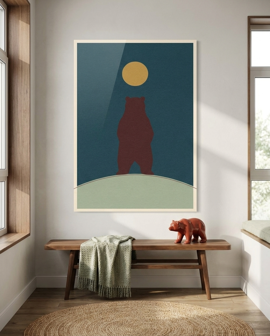
The eight posters share three rules. First, a single set of inks: deep petrol blue, ink navy, cinnabar red, mustard ochre, sage green and warm paper white, with overprints where two inks cross and give a third, darker tone. Second, a format: tall vertical, with the animal placed on an invisible grid and a calm margin all round. Third, a private symbol: in every poster a single full circle appears — a sun, a moon, an eye, a ring of fur — so that the series reads as one family.
Four of the eight sit on a dark ground, four on a light one, and each carries one large dark mass, so they read from across a room. The grain, the faint misregistration and the unevenness of the ink are kept on purpose: they are what keeps a flat design from feeling like a screen.
One note from the studio. The swallows were drawn as a flock of seven; the version that came out best held six, so the poster carries that number and its title: Six Swallows.
The sale — the gallerist’s word
These are easy works to live with. Hang two of them side by side — a dark ground next to a light one — and you have a pair that works over a bed or a console. Hang four in a grid and the circles line up into a quiet rhythm across a long wall. Keep one on its own in a kitchen or a hallway and it becomes the single graphic accent of the room.
Each work is printed on 4 mm acrylic glass, backed with Dibond. The lacquered face deepens the navy, makes the cinnabar glow and gives the flat shapes a clean, almost wet edge, which suits this kind of picture very well.
The eight works
- Heron Line — a grey heron as one tall arc and a sharp beak, standing in bands of sage and petrol water before a cinnabar sun.
- The Curled Fox — a sleeping fox coiled into a perfect ring, its tail a mustard crescent, under a thin moon on deep petrol.
- Two Moons — an owl made of two concentric eyes and a triangle body, perched on one branch on oxblood.
- Hare in the Tall Grass — a hare in mid-leap drawn in a single black line across a field of ochre stripes.
- The Deep Arc — a whale’s fluke rising as one navy arc from banded sea, a cinnabar sun cut by the horizon.
- Stag at the Treeline — a stag in profile whose gold antlers branch into a row of pines, under a full moon.
- Six Swallows — a rising diagonal of navy chevrons across a cinnabar field, toward an ivory sun.
- Bear and Moon — a standing bear in one rounded block of oxblood under a mustard moon on petrol blue.
See the whole series here: Field Marks.