

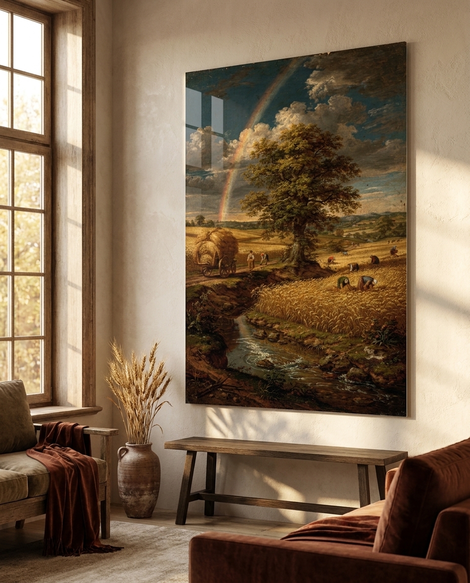
Just a few days’ ride south of the calm Dutch rooms we visited last time, the same century chose a completely different temperature. In Antwerp and the southern Netherlands, painting in the first half of the seventeenth century turned loud, warm and generous: cloth sweeping on the diagonal, tables heaped with fruit and silver, horses wheeling against a bruised sky, and a glowing amber ground shining up through every shadow. The Flemish Baroque is abundance made visible — a style that believed a picture should give you more than you asked for.
Where the Flemish Baroque sits in the story of art
The Flemish Baroque flourishes roughly between 1600 and 1660, in the provinces that stayed under Spanish rule and Catholic after the northern half of the Netherlands broke away. It is the exact contemporary of the Dutch Golden Age, and the two share a border, a language and a painting tradition inherited from the Northern Renaissance. Yet they could hardly look more different.
The reason is patronage. Where the Protestant north whitewashed its churches and sold pictures on an open market to middle-class households, the Catholic south was rebuilding its churches after decades of war and iconoclasm, and it wanted splendour. Altarpieces, ceilings, tapestries, hunting pictures and portraits poured out of large Antwerp workshops for the Church, the court in Brussels and noble houses across Europe. Painters here had also been to Italy: they had seen Venetian colour and the drama of the Roman Baroque, and they brought both home — but warmed them, loosened them and set them in motion.
Its influence runs long. The elegant Flemish court portrait shaped aristocratic portraiture in England for more than a century, the great flower and banquet pieces set the model for decorative still life, and the loose, warm, flowing brushwork was rediscovered again and again, from the painters of the eighteenth century to the colourists of the nineteenth.
What actually defines it
Movement on the diagonal. Compositions rarely sit still. Drapery, curtains, branches, manes and whole groups of figures sweep across the picture on strong diagonals and spirals, so the eye is carried through the canvas rather than resting on it.
Warmth from beneath. Flemish painters worked on warm, often streaky brown grounds and kept their shadows thin and transparent, so the underlayer glows through as amber and cognac. The lights, by contrast, are laid on thick — creamy crests of white on a fold of satin, a grape, a petal.
Abundance as a subject. The banquet table, the market stall, the flower garland crowding the whole frame: plenty itself becomes something to paint, a celebration of the good things of the world and, quietly, a reminder that they do not last.
Texture you can almost touch. Velvet, silk, lace, fur, silver, porcelain, the wet skin of fruit — each material has its own brushstroke. The painters of this school were virtuosos of surface, and they loved to show it off.
Animals and nature at full force. Horses, lions and hunting scenes were a Flemish speciality, painted with swelling muscle and flying mane, and the landscapes are big, warm and alive, with rainbows, hay wagons and weather rolling in.
The palette. Cognac, rust, oxblood and merlot, warm gold and ivory, moss green and olive, with deep petrol blue in the skies and shadows. Rich rather than dark; warm rather than bright.
The need
After the silver daylight and quiet order of the Dutch rooms, our three experts wanted the full orchestra again. The Flemish Baroque is the movement of generosity, and there are rooms that need exactly that: a dining room that should feel festive, a library or a hallway that needs one commanding picture, a lounge that wants warmth rather than minimalism. These works were made to win against a busy wall and to read clearly from across a room.
The brief kept every sitter an invented adult, fully and formally dressed in the fashion of the period, and every composition original: no known altar, no identifiable house, no quotation of a famous canvas. The eight subjects map the specialities of the Antwerp workshops — the flower garland, the banquet piece, the male and female court portrait, the animal painting, the warm landscape, the Catholic church interior and the monumental animal study.
The production
The art direction fixed one language for the whole set: oil on warm-grounded canvas or panel, a loaded and confident brush, thin amber glazes in the shadows, thick lead-white crests on the lights, fine age craquelure and a mellow old varnish. Every master then went through the studio’s quality control. Paintings in this manner tend to arrive with invented signatures and inscriptions tucked into corners and folds, and each one was found and cleaned by hand before the works were placed in their rooms for the shop. The horse and the silver gown were redrawn until they met the brief, and the church interior was replaced by a new composition when the first version fell short.
The production, seen work by work
The Summer Garland is the Antwerp flower piece: a dense oval garland of roses, tulips, peonies and irises wound around a carved stone cartouche that bears only ornament, with dew, a butterfly and a beetle for anyone who looks closely.
The Loaded Table is the banquet at its most generous — a crimson velvet cloth falling on the diagonal, a tall silver ewer, blue-and-white porcelain, grapes and peaches spilling over the edge, a curling lemon peel and a red lobster gleaming on pewter.
The Lace Collar is the restrained side of the Flemish portrait: an invented nobleman in black silk, a broad white lace collar and cuffs catching the light, one gloved hand resting on a table edge.
The Silver Gown answers it in satin: a noblewoman in the fashion of Antwerp in the 1630s, a flat lace collar over the shoulders, a crimson curtain swinging behind her and long crests of light sliding down her skirts.
The Horse Before the Storm puts one riderless dapple-grey stallion on a grassy rise, rearing in clear profile, mane and tail thrown by the wind, with a single warm break of light low on the horizon.
Rainbow Over the Fields is the warm landscape after rain: ripening corn to a low horizon, a great oak on the diagonal, a laden hay wagon, a winding stream and a full rainbow arcing over it all.
The Golden Altar is the Catholic south’s reply to the bare white churches of the north: a pale limestone nave, a black-and-white marble floor in deep perspective, and at its end a towering altar of dark marble and gilded carving framed by swags of crimson velvet.
The Lion’s Head closes the set with a monumental animal study: a calm, tawny head turned slightly on the diagonal, the great mane swirling in loaded strokes of cognac, rust and gold.
The sale
Each work is offered as a print face-mounted behind acrylic glass, in nine sizes, ready to hang. This movement suits the finish especially well: the glossy face deepens the warm transparent shadows and makes the thick highlights — the crest of a satin fold, a silver ewer, a dewdrop, the gold of a lion’s eye — stand out with an almost tactile relief.
These are pictures for rooms with character. The garland and the banquet belong in a dining room or above a sideboard. The two portraits bring quiet authority to a study, a library or a bedroom, and they hang beautifully as a pair. The horse, the landscape and the lion are the big-statement pieces for a living room, a staircase or an office, while the golden altar gives an entrance hall or a reading room real depth. Pair them with wood, brass, velvet and deep-toned walls — oxblood, olive or petrol blue — and give them warm, low light.
See the collection
The eight works are here: Flemish Baroque.
Next in the chronological walk through art history: the Spanish Golden Age, where the same century turned to sober realism, deep blacks and a quiet, almost mystical stillness.