Description
Purpose
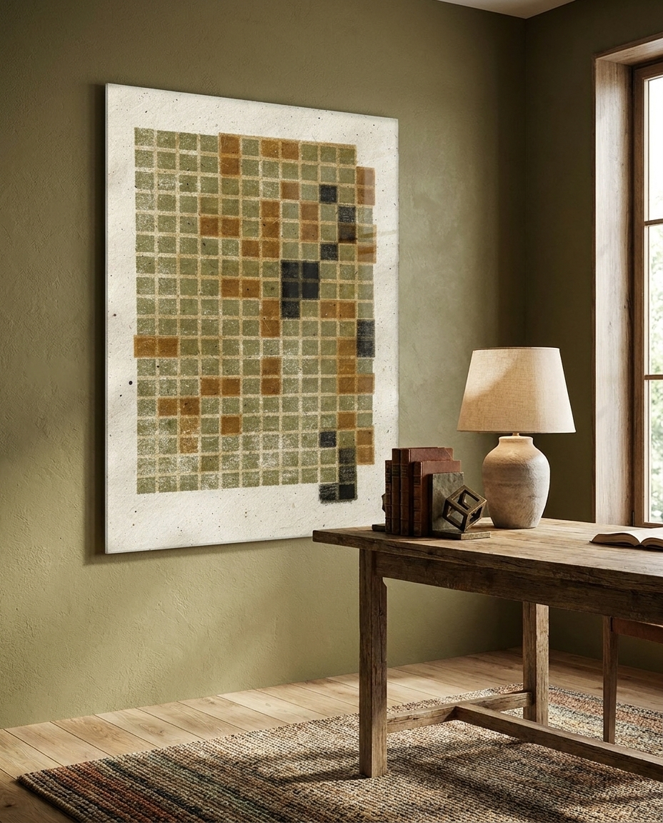
This piece seeks to elevate the simple grid into a meditative ritual, expressing the beauty found in registration errors, ink blooms, and the honest fatigue of the hand-pulled process.
This work explores the delicate tension between mathematical order and the soulful unpredictability of the human touch. Each small square is a study in character, where olive-grey and burnt sienna inks bleed softly at the margins, creating a visual vibration that feels less like a grid and more like a woven tapestry. The generous white space below allows the composition to breathe, anchoring the eye in a moment of profound, intentional stillness.
Living with this piece is an invitation to slow down and notice the micro-details of existence. The organic textures and shifting ink densities respond beautifully to the changing light of the day, revealing new depths in the shadows of the paper’s grain. It is a grounding presence for a thoughtful interior, offering a sophisticated balance of architectural structure and earthy, artisanal warmth.
Interior Decorator’s Advice
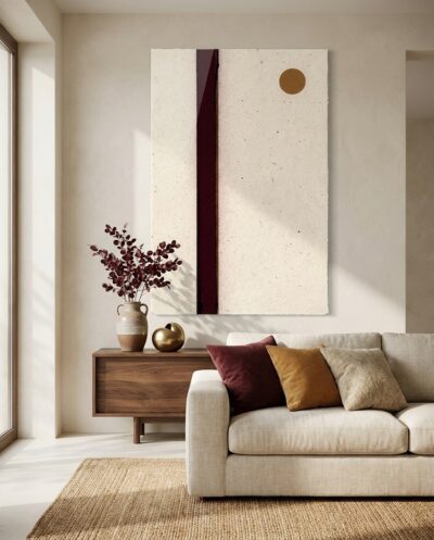
- Place on a neutral, textured wall such as lime-wash or raw plaster to echo the paper’s tactile nature.
- Utilize soft, directional gallery lighting to emphasize the subtle plate impressions and fiber textures.
- Pair with mid-century teak furniture or dark walnut accents to pull out the warmth of the burnt sienna tones.
Perfect For
- The collector who finds poetry in the ‘perfectly imperfect’ philosophy of Wabi-Sabi.
- Design enthusiasts who appreciate the legacy of Bauhaus geometry tempered by organic materials.
- Those seeking a quiet, intellectual focal point for a space dedicated to deep work or reflection.
From the Press and Plane collection:
There is a gentle tension running through this collection, and it is what makes each piece breathe. Take the clear grammar of the Bauhaus — that early-twentieth-century school where art and craft learned to speak the same clean language of circles, bars and grids — and pull it by hand. The ink lies thick and matte, colours drift a fraction off-register, one edge is torn rather than trimmed. The geometry stays confident and composed; the making stays warm and unmistakably human. The name says it plainly: the press that prints, the plane it prints upon.
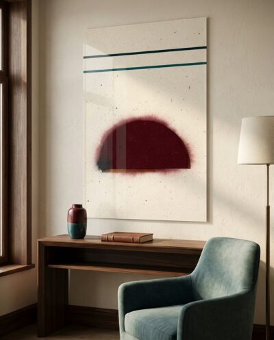
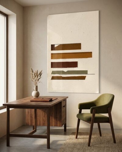
Across the eight works, a single afternoon of printing unfolds — terracotta and caramel, merlot and olive-grey, a deep teal ascending across cloud-white ground. Each holds its own quiet authority, yet they were composed to converse, sharing palette, rhythm and paper from wall to wall. To live with them is to invite a rare kind of calm: order without coldness, discipline softened by the touch of a hand. Hang one and it steadies a room; hang several and they hum together like notes in the same warm chord.
Key Features
- Material: High-definition Lambda Print — true silver-halide photographic exposure (Fuji Crystal DP II for colour, Ilford for black & white) on premium acrylic glass, glossy finish for exceptional depth and clarity.
- Finish: Face-mounted under 4 mm premium acrylic glass — Diasec technique.
- Backing: 3 mm alu Dibond composite panel.
- Style: Geometric Abstraction
- Edition: Unlimited.
- Mounting: Recessed aluminium subframe — ready to hang (invisible wall mounting, 25 mm offset).
- Longevity: 50–75 years archival conservation.


Reviews
There are no reviews yet