For about twenty-five years, around the turn of the sixteenth century, Italian painting seemed to hold its breath. Everything the previous two centuries had been working out separately — how a body stands, how space recedes, how light turns a form, how a group holds together — arrived at once, in the same rooms, in the hands of a few people who happened to be alive at the same time. Then it passed. This collection is our homage to that short, impossibly concentrated moment.
Where the High Renaissance sits in the story of art
The High Renaissance is conventionally dated from about 1495 to about 1520, and it belongs to three cities: Florence, Milan and above all Rome, where a series of ambitious popes turned the papal court into the best-funded building site in Europe. Behind it lies the Early Italian Renaissance, which had spent a hundred years teaching painting to be credible — giving figures weight, floors depth, faces feeling — and then a further century refining perspective into a mathematics. Ahead of it lie Mannerism, which will deliberately unbalance everything the High Renaissance balanced, and the Baroque, which will set it in motion.
What makes the period unusual is not that it invented much. Almost every technical ingredient was already available: oil paint had come south from Flanders, linear perspective had been codified by Brunelleschi and Alberti, anatomy was being studied from life. What changed is that these tools stopped being visible as tools. In the Early Renaissance you can watch a painter thinking, working out a floor, testing a foreshortening. In the High Renaissance the thinking has been absorbed, and what remains on the panel is a resolved, unhurried calm in which nothing looks solved because nothing looks like a problem.
It is also, famously, brief. The generation that defines it — Leonardo, Michelangelo, Raphael, Bramante — overlapped for barely two decades. Raphael died in 1520 at thirty-seven, and the equilibrium died with him; the next generation, unable to improve on the balance, chose instead to twist it. That is why the High Renaissance functions in art history less as a style than as a standard: a fixed point that every later European movement either aspires to, argues with, or defines itself against.
What actually defines it
Stable geometry. The signature device is the pyramid: a group composed into a calm triangle, wide and secure at the base, closed at the apex. Around it, centred arches and symmetrical bays. Every mass sits inside an underlying geometry the eye feels before it notices. Balance, but never stiffness — the figures move within the structure rather than posing on it.
Sfumato. Leonardo’s word, from fumo, smoke: modelling that passes from light into shadow “without lines or borders, in the manner of smoke”. Built in dozens of nearly transparent oil glazes, it lets a contour dissolve into the surrounding air while the form underneath stays completely solid. It is the opposite of blur, and it is the reason these faces seem to be lit by the room rather than drawn onto it.
Perspective that no longer strains. A single vanishing point, coffers and pavement squares that genuinely converge, architecture you could measure. After a century of charming approximations, space becomes rational — and then, tellingly, painters stop drawing attention to it.
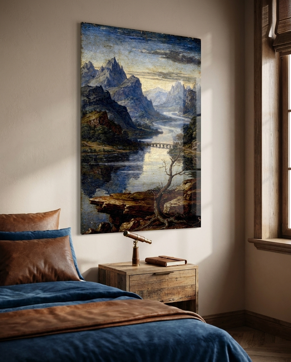
Aerial perspective. Distance rendered not by drawing but by air. Contrast falls away, edges soften, and everything turns progressively cooler and bluer toward the horizon. It is the single most quietly revolutionary observation of the period: that the atmosphere between us and a mountain is itself a visible substance.
Idealised gravity. Faces of grave, generalised beauty; downcast or inward gaze; unhurried gesture. Emotion is contained rather than performed. The period is looking for the type behind the individual — which is exactly what later centuries would both admire it and reproach it for.
Four surfaces. Thin oil glazes over a luminous underpainting on walnut or poplar panel; buon fresco for walls and vaults; red chalk and silverpoint on prepared paper for the thinking; and carved Carrara marble, where the same idealism is subtractive. Our collection deliberately visits all four.
The need
Our interior decorator’s argument for this movement is unusually simple. The dominant interior mood of 2026 is warm, layered and atmospheric: jewel tones, earth browns, deep blues, surfaces you want to touch. A period built on umber shadow, crimson lake, lapis blue and ivory light sits inside that palette without any adaptation at all. And the current preference for one large, quiet, structuring piece over a busy arrangement of small ones is exactly what this art was designed to do — these are images built around a centre, which means they organise a wall rather than decorate it.
There is a second, less obvious fit. The market has moved decisively toward the visible mark of the hand: brushwork, grain, craquelure, honest wear. Smooth and frictionless now reads as generic. Glazed oil surfaces, chalk on rough laid paper and chisel-tracked marble are about as far from frictionless as a wall image can get.
The production
The rule we set ourselves is the same one that governs this whole series: homage, never reproduction. Not one of these eight works quotes an existing painting, cartoon, statue or building. The sitters are invented, the architecture is invented, the ornament is invented. What is borrowed is the language — the pyramid, the smoke-soft transition, the blue distance, the sanguine hatching — and a language belongs to nobody.
That rule also shaped the curation. The obvious way to represent this period is through monumental figure sculpture and the nude, which is the axis on which much of its reputation turns. We chose deliberately not to go there, and to build the eight instead around what the period did with cloth, air, stone, ornament and space. It is not a compromise: the drapery study and the aerial landscape are as central to how these workshops actually thought as anything more celebrated, and they make a far better collection to live with.
Each image was composed vertically, in the spirit of the panel, the pilaster and the chapel bay, and carries the surface of its own medium — glaze translucency and craquelure, chalk grain and paper tooth, claw-tooth chisel marks in marble.
The production, seen work by work
- The Stable Triangle — three robed figures locked into a calm pyramid beneath a round-arched niche, with a strip of hazy blue country behind them.
- Sfumato — an invented sitter on a bare stone ledge, her contour dissolving into warm shadow, a blue river valley receding far behind.
- The Ideal Temple — a centrally-planned interior in rigorous one-point perspective: coffered vault, paired pilasters, a distant lit dome, a chequered floor converging exactly.
- Blue Distance — pure aerial perspective: peaks dissolving into lapis haze, a river threading toward a pale horizon, one bare branch in the warm foreground.
- The Weight of Cloth — a red-chalk drapery study, dense sanguine hatching with white heightening on the crests of the folds. The period’s thinking, made visible.
- Grotesques of the Loggia — an ornamental pilaster panel in the antique-revival manner: a candelabra spine of acanthus, urns, garlands and small birds on white, between panels of deep red.
- Non-Finito — a serene idealised marble head above a block left raw with point and claw-tooth marks: the finished and the unfinished in one object.
- The Painter’s Table — the workshop still life: porphyry slab and glass muller, ground ultramarine, raw lapis, walnut oil, brushes, a wooden articulated hand.
The sale
Our gallerist makes two points. The first is recognition without repetition. This visual language is understood instantly by almost everyone — it is the default mental image of “Renaissance” — yet none of these eight images is a picture anyone has seen before. The work reads as a discovery rather than a poster of a masterpiece, which is a very different thing to own.
The second is material fit. Deep lapis, crimson lake, warm umber and ivory light are precisely what an acrylic face-mount carries best: the acrylic conducts light down into the image and gives the blues and the shadows a depth they cannot reach on paper, with no light source of its own. The blue distances in particular gain a genuine sense of recession behind the surface.
Each work is produced as a museum-quality print under acrylic glass, in the sizes and formats listed on its product page.
See the collection
This is the twentieth movement in our chronological journey through the history of art, which began with Paleolithic cave painting and continues, one movement at a time, toward the art of 2026. The previous stop was the Early Italian Renaissance, a hundred years earlier and a world away in confidence. Next, we cross the Alps to the Northern Renaissance, where painters reached a comparable mastery by an entirely different route — through detail rather than through ideal form.