In the same decades that Florence was learning to compose a perfect pyramid, painters four hundred miles to the north were solving a different problem entirely. They were not looking for the ideal body. They were looking at a brass bowl, a strawberry leaf, a fur collar, a distant roof tile — and asking how much of it could be got onto an oak panel. The answer, it turned out, was all of it. This collection is our homage to that patience.
Where the Northern Renaissance sits in the story of art
The Northern Renaissance runs from roughly 1420 to about 1560, and it belongs to Bruges, Ghent, Brussels, Antwerp, Haarlem and Nuremberg — the wealthy, crowded, mercantile cities of Flanders, the Low Countries and southern Germany. It begins at almost exactly the same moment as the Early Italian Renaissance, and for a century the two run in parallel without either being a version of the other.
The difference is one of starting point. Italy came out of fresco and sculpture, and it went looking for the ideal: proportion, anatomy, measured space, the type behind the individual. The North came out of manuscript illumination and the goldsmith’s bench, and it went looking for the actual: this face, this thread, this reflection, this weather. Where the High Renaissance dissolves a contour into smoke, the North sharpens it until you can count the hairs.
What made that possible was a technique. Northern workshops did not invent oil paint, but they were the first to understand what it could do: laid in thin translucent glazes over a smooth white chalk ground, colour stops sitting on the surface and starts behaving like stained glass — light passes down through it, strikes the white beneath, and comes back saturated. That is why these panels still look lit from inside six hundred years later, and it is why oil, not fresco, became the medium of European painting. The traffic eventually ran south: Italian painters wanted the Flemish technique, and got it.
The other invention was quieter and just as consequential: the idea that a picture could be a room. Northern painters put their subjects in furnished interiors with real windows, real floors and real weather outside, and filled those rooms with ordinary objects that carry meaning without announcing it — a lit candle, a caged bird, a bowl of water, a fallen glove. Art historians call it disguised symbolism. It is the beginning of a European tradition in which a still life, a domestic corner or a landscape can be the whole subject, and it leads directly to the Dutch Golden Age a century later.
What actually defines it
Detail distributed evenly. The signature move is the refusal to summarise. A distant church tower gets the same attention as the sitter’s chin. Individual hairs, the weave of a linen towel, the pile of velvet, a fly on a sill. Nothing dissolves, nothing is left approximate, and the far distance stays in focus.
Glazes on oak. Thin translucent layers over a white ground, so the colour glows rather than sits. Deep, enamel-hard, jewel-like. With age comes the rest of the surface: fine craquelure, a warm varnish, the vertical grain of the panel showing through at the edges.
The disguised symbol. Meaning hidden inside the furniture. An ordinary object placed with intent, readable by a contemporary and quietly available to everyone else as simply a beautiful thing on a table.
Real light from a real window. A cool northern daylight entering from one side, crossing a plank floor, catching a brass rim, throwing a proper cast shadow. Not the golden ground of the century before — a room with weather in it.
The world through an aperture. The North’s answer to Italian perspective: not a vanishing point but a window, an arch or a convex mirror that opens onto a minutely painted town and a green river valley going away into the distance.
The engraved line. The other half of the period is monochrome. Copperplate engraving — pure burin work, swelling lines, cross-hatching, flicks for the half tones — turned Northern imagery into the first mass medium in Europe, and made its makers famous well beyond the towns that fed them.
The need
Our interior decorator’s case for this movement is a seasonal one. The palette running through 2026 and into 2027 is warm, saturated and grounded — oxblood, cognac, rust, deep forest and olive, brass and dark oak — which is, almost exactly, a Flemish panel. These works need no adaptation to a contemporary wall; they were already that colour.
There is a second argument, and it is about competition. Walls have got busier: patterned paper is back, and the crowded gallery arrangement has thinned out to three or four pieces given room to breathe. Art now has to win against its background. Deep saturated colour on a dark ground, high contrast and a subject legible from three metres is what wins — and then rewards the person who walks up close and finds that the far bank of the river has boats on it.
The production
The rule for this series is unchanged: homage, never reproduction. Not one of these eight works quotes an existing panel, altarpiece, print or manuscript. The sitters are invented, the towns are invented, the ornament is invented, and the coats of arms simply do not exist. What is borrowed is the language — the glaze, the convex reflection, the aperture, the burin — and a language belongs to nobody.
Two curatorial choices are worth stating. First, we built the eight around what this period did with cloth, brass, ice, gold leaf, ink and glass rather than around its religious commissions, where most of its surviving masterpieces sit — the domestic corner and the winter valley are as native to these workshops as any altarpiece, and they make a far better collection to live with. Second, everything written in these images is deliberately illegible: ornamental invented marks, never words. A period this obsessed with inscriptions is best honoured by leaving the text out.
Every image is composed vertically, in the spirit of the panel, the altarpiece wing and the manuscript leaf, and carries the surface of its own medium: glaze translucency and craquelure, burnished gold, the chain lines of laid paper, the bite of the burin, honest abrasions at the edges.
The production, seen work by work
- The Convex Mirror — a small bulging mirror on a plank wall, reflecting an entire furnished chamber in miniature: a chandelier, a red bed hanging, two robed figures seen from behind.
- The Unknown Sitter — an invented face against pure black, given the period’s pitiless clarity: pores, a broken vein, tired lids, one grey hair escaping the scarlet chaperon.
- Brocade and Brass — the corner of a Flemish chamber: crimson pomegranate velvet, a polished brass basin holding a window reflection, white lilies in a faience jug, a snuffed candle.
- Strawberries in the Margin — an illuminated leaf in the Ghent-Bruges manner: trompe-l’oeil strawberries, columbines, a snail and a dragonfly casting real shadows on burnished gold, around a small walled garden.
- Cut with the Burin — a copperplate engraving on laid paper: a wooded ravine, a water mill, a hollow oak and two cloaked travellers, built entirely from swelling black line.
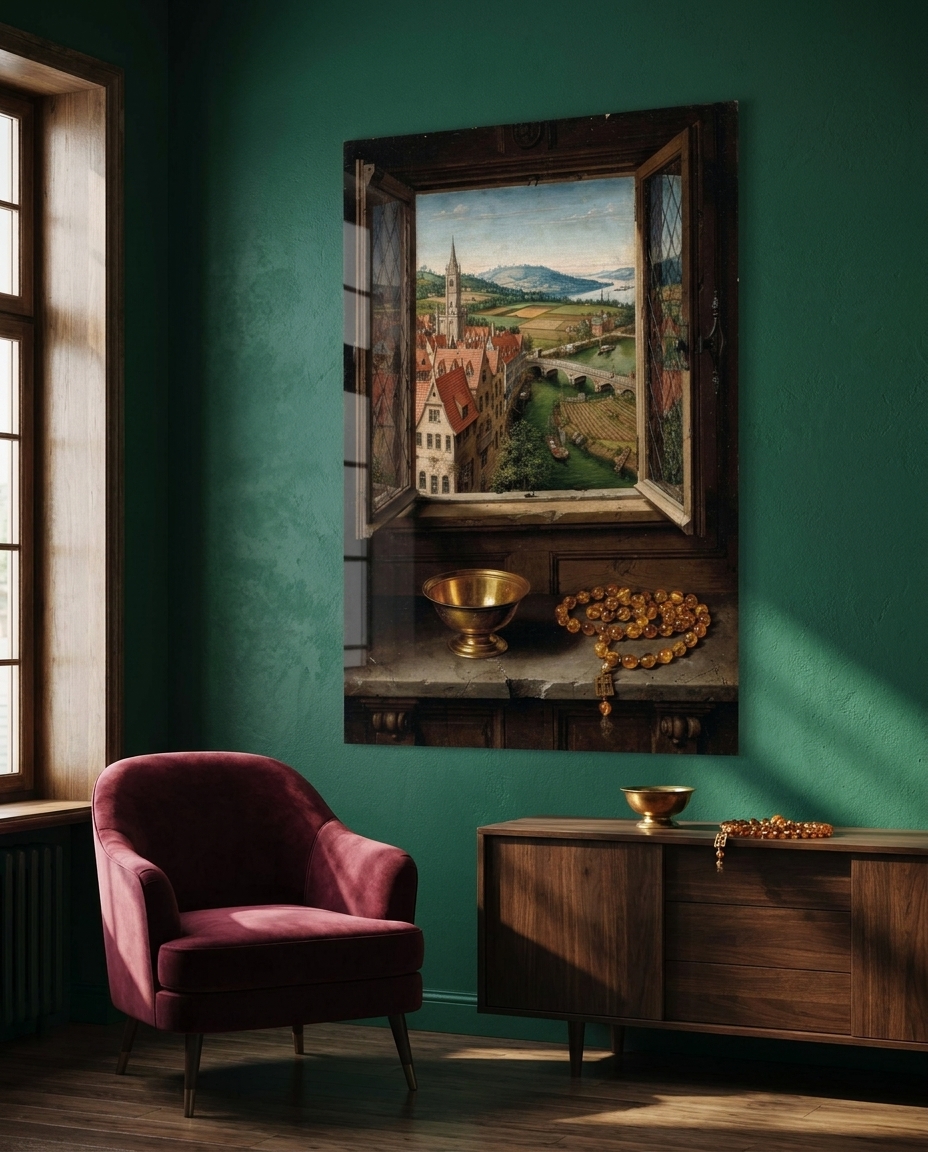
- A Window on the World — a leaded window standing open onto red gables, a church tower, barges on a green river and blue hills, with a brass bowl and amber beads on the sill in the near dark.
- The Frozen Kermesse — a winter valley from a high viewpoint: skaters and sledges on a frozen river, bare trees drawn twig by twig, crows on a branch, an ochre sky.
- The Grisaille Wing — the closed outer wing of an altarpiece, painted in stone-coloured grisaille: two draped figures imitating statues in their niches, with the iron hinge still at the edge.
The sale
Our gallerist makes two points. The first is that this is the most legible old-master language there is. Everyone recognises it instantly — the oak panel, the fur collar, the tiny distant town — and yet not one of these eight images is a picture anyone has seen before. It reads as a discovery rather than as a poster of a famous painting, which is an entirely different thing to own.
The second is material fit. Deep glazed colour on a dark ground is precisely what an acrylic face-mount carries best: the acrylic conducts light down into the image, so the oxblood, the forest green and the burnished gold gain a depth that paper cannot reach without a light of its own. It happens to reproduce, by an industrial route, the exact optical effect the Flemish glaze was invented to produce.
Each work is produced as a museum-quality print under acrylic glass, in the sizes and formats listed on its product page.
See the collection
This is the twenty-first movement in our chronological journey through the history of art, which began with Paleolithic cave painting and continues, one movement at a time, toward the art of 2026. The previous stop was the High Renaissance, the same years seen from Italy and reached by the opposite road. Next we return south, to Venice, where a third path opens: not line, not detail, but colour itself.