
Every art student is taught the argument, usually in a sentence: Florence drew, Venice painted. Like most sentences that survive five centuries, it is a simplification hiding something genuinely radical. Venice did not merely prefer colour. Venice decided that colour was the picture — that form could be built out of warm tone meeting warm tone, with no drawn line underneath holding it together. This collection is our homage to that decision, and to the wet, golden, mercantile city that made it.
Where the Venetian Renaissance sits in the story of art
The Venetian Renaissance runs from roughly 1470 to about 1580, and it belongs to one city and its mainland: Venice itself, and the Veneto towns behind it. It overlaps almost exactly with the High Renaissance in Rome and Florence and with the Northern Renaissance in Bruges and Nuremberg. Three roads, the same century, three different answers to the question of what a painting is actually made of.
Central Italy answered disegno: drawing, contour, the perfected design that exists before the paint arrives. The North answered detail: patient, even, jewel-hard observation of every thread and roof tile. Venice answered colorito — the picture made directly in coloured paint, form emerging from tone, edges allowed to soften and lose themselves in shadow. The three positions were argued about at the time, sometimes bitterly, and the argument shaped European painting for the next three hundred years.
Geography did most of the deciding. Venice is built on water, and salt damp destroys fresco and warps wooden panel. So Venetian workshops turned to something the city had in vast supply from its shipyards: canvas. Painting on woven cloth over a warm ground changed everything. The weave broke the stroke and gave the surface a tooth; the warm ground glowed up through the thinner passages and made every shadow warm; and the sheer scale canvas allowed — roll it, move it, hang it — let painting escape the wall for good. The portable picture we still buy and hang today is, in a real sense, a Venetian invention.
The city’s other advantage was its warehouses. Venice was the hinge between Europe and the eastern Mediterranean, and its pigments arrived on its own ships: lapis lazuli ground into ultramarine, worth more than gold by weight; kermes, the deep crimson from an insect of the Mediterranean oak. Venetian painters had access to colour that painters elsewhere simply could not buy, and they used it as a subject in its own right rather than as a filling for outlines.
What came out of that combination was, by the end of the period, something genuinely new: paint that had stopped pretending to be anything but paint. In the late Venetian manner the brushwork stands proud of the weave, colours are dragged and broken over one another, whole passages are scraped back, and the picture only resolves when you step away from it. Contemporaries complained that the pictures looked unfinished up close. They were right, and it was the point. That road runs directly to nothing in antiquity and directly forward to Rubens, to Rembrandt, to Turner, and eventually to Impressionism.
What actually defines it
Colour instead of contour. The defining move is the absence of the drawn line. An edge in a Venetian picture is one warm colour meeting another, and where the light fails the edge is allowed to dissolve into the ground rather than being held by an outline. Forms arrive out of tone and are permitted to leave the same way.
Canvas, and a warm ground. A coarse visible weave, a red-brown or ochre priming glowing up through everything painted thinly over it. Every shadow in the picture is warm because the ground beneath it is warm. Nothing is cold, nothing is grey.
Glaze in the darks, loaded paint in the lights. Deep translucent glazes where the light sinks in and comes back smouldering, set against thick dragged strokes of lead white and pale ochre standing physically above the weave. Two entirely different paint surfaces in a single picture.
The golden light off the water. A warm, humid, late-afternoon light that gilds what it touches and lets the distance dissolve into a rose-gold haze. Venetian distance is atmospheric, never sharp — the exact opposite of the Northern habit of painting the far hills as crisply as the near hand.
Fabric as a subject. Crimson velvet, pomegranate brocade, gold thread, fur, glass. The material wealth of a trading empire, painted for the frank pleasure of the stuff itself.
Poesia. The Venetian invention of the landscape as pure mood: warm storm light, dark trees, a distant tower, small figures who explain nothing. A picture with an atmosphere instead of a story — arguably the most modern idea the sixteenth century produced.
The need
Our interior decorator asked for this collection before the art director did, which does not happen often. The reasoning was specific to this autumn. The dominant palette for the season is saturated warm earth — cognac, rust, oxblood, merlot, burnt copper — and the walls those colours live on are increasingly busy: heavy wallpaper is back, and it takes the whole wall. Art now has to win against a patterned ground rather than sit politely on a blank one. That means a dark field, high contrast, and a subject still readable from three metres away.
Venetian painting is almost a specification for exactly that. It is built on a warm dark ground, its contrast is dramatic, and its colour is precisely the season’s palette four hundred and fifty years early. The decorator also made a narrower point: a single large piece has replaced the dense grid of frames as the thing people actually want on a main wall, and this is a language that carries at large scale, because it was invented for rooms far bigger than ours.
The production
Our art director set one rule above all the others: the hand had to stay visible. This is a period whose whole late achievement is the refusal to smooth things out, and it would have been perverse — and dull — to render it as a clean, seamless, glassy image. So the brief demanded the coarse weave reading up through the paint, standing ridges of loaded colour, dragged and broken strokes, passages scraped back to the bare canvas, a warm ground glowing through, and the fine craquelure and small honest losses of a surface that has aged.
The second rule was one of curation, and it is worth being open about. Venetian painting is famous for its reclining nudes, and that is genuinely one of its central subjects. We chose to build this collection somewhere else entirely: on portraiture, weather, fabric, music, architecture and the painted surface itself. Not out of squeamishness, but because these eight are the parts of the Venetian achievement that are least reproduced and least understood — and because the collection is stronger for being made of the things people do not already have a postcard of.
The pictures themselves are inventions. No existing painting is reproduced and no real sitter is portrayed: the faces, the palaces, the fabrics and the weather are all made up. The one deliberate exception is the lagoon at sunset, which looks across the basin toward the campanile and the arcades of the old city — the view every Venetian painter painted, and the one place where inventing an alternative would have been a worse picture and a poorer piece of history.
The production, seen work by work
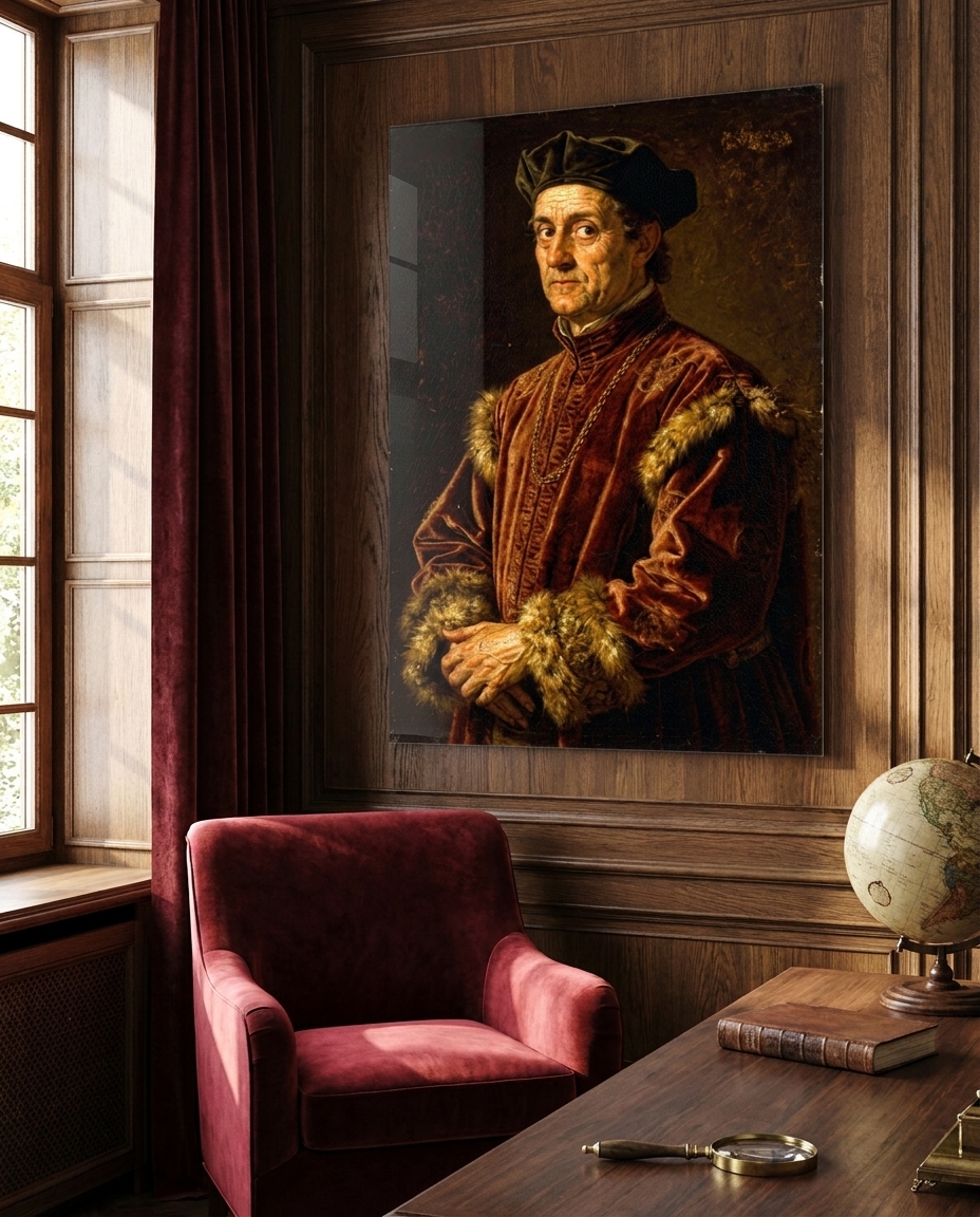
- Kermes and Gold — an invented sitter in crimson kermes velvet and fur against a warm dark ground, the face modelled purely in warm tone and losing its shadowed side entirely into the background.
- The Storm Beyond the Wall — a poesia of the mainland: sultry pre-storm light, one distant lightning branch over a brick tower, a ruined arch, dark oaks, two small cloaked travellers who explain nothing.
- The Consort of Instruments — a lute on its back, the scrolled neck of a viol, an open part-book, a glass of dark wine and three ripe figs on crimson velvet, in warm raking light.
- Ultramarine and Crimson — drapery alone: lapis silk and gold-threaded brocade falling over a worn stone ledge. The entire subject is the behaviour of two colours and the light caught in the folds.
- Sotto in Su — a ceiling seen steeply from below: a painted stone balustrade opening onto copper evening cloud, a peacock on the rail, one robed figure leaning over to look down at you.
- The Lagoon at Vespers — a tall sky of gold and bronze over a far shore dissolving into haze, dark-sailed boats and weathered mooring poles in slack green-gold water. Atmosphere and tone, nothing sharp.
- Palazzo on the Water — an invented gothic facade seen from the canal: pointed arcades and quatrefoil tracery in Istrian stone, plaster stained at the waterline, reflected light wobbling up the wall.
- The Bozzetto — a full-length figure study laid in on bare warm canvas: the ground left showing everywhere, the room never resolved, the brocade built up in thick loaded strokes, and the raw tacking edge of the cloth still visible down one side.
The sale
Our gallerist makes two arguments for this one. The first concerns what is actually rare now. When a technically flawless image can be produced by anyone in seconds, technical flawlessness stops being worth paying for, and what collectors reward instead is evidence of decision-making — intention, series, a visible hand. Late Venetian painting is the historical origin of exactly that value: it is the moment European art decided that a picture showing how it was made is better than one that hides it. These eight are built on that principle rather than on polish.
The second is material. Deep glazes over a warm ground are what a print under acrylic glass carries better than any other surface: the acrylic conducts light down into the image and returns it, so the crimson, the ultramarine and the gold gain a depth that paper cannot reach on its own. Venetian painters spent their careers chasing precisely that effect — light entering colour and coming back out of it — and here an industrial process happens to deliver it. Hung against a matt wall, in a slim matt frame, the gloss becomes the one reflective surface in a tactile room, which is exactly where this season wants it.
Each work is produced as a museum-quality print under acrylic glass, in the sizes and formats listed on its product page.
See the collection
This is the twenty-second movement in our chronological journey through the history of art, which began with Paleolithic cave painting and continues, one movement at a time, toward the art of 2026. The previous stop was the Northern Renaissance, which answered the same century with detail where Venice answered with colour. Next the balance tips deliberately off-centre, into Mannerism — where the Renaissance, having solved everything, starts elongating, twisting and unsettling its own perfection on purpose.